
While there are a wide range of colors that can be used for digital renditions of heraldic art, the set of colors that gets discussed most often in the context of SCA submissions is the one used for OSCAR’s “color checker” display.
When armory images are uploaded to OSCAR, color-checker thumbnails are generated which convert each area to one of these standard tinctures. This doesn’t mean you should use those specific colors in your graphics, but it does simplify things if the colors in your image are not transformed incorrectly.
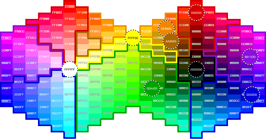
The tinctures used by OSCAR’s color-checker thumbnails are shown in dashed circles below, with outlines delimiting the range of colors that are converted to each of those targets.
(Click for a larger image, or download a printable PDF.)
While the color-checking process usually goes smoothly, there are a few things to watch out for:
- Warm golds (containing more red than green) can end up being rendered as orange or brown.
- Warm browns can develop streaks or splotches of red.
- Blues and purples can become ambiguous if they come too close to the violet boundary.
- Although not apparent on this chart, fine-line details, like black outlines within a charge or around an argent charge in a fieldless badge, can disappear entirely, so it’s better if the overall silhouettes of your charges are still recognizable without that detailing.
Many thanks to Elena Wyth for the experimentation which allowed these OSCAR ranges to be estimated.
2 thoughts on “OSCAR Color Gamuts”